The Story Behind The World's Most Expensive Logos
Published
Sometimes, we see logos to be just colours and texts. However, logos are a lot more than just aesthetics; they represent your brand. A logo defines your brand and makes your business stand out. It speaks to people and earns you customers. Your logo would be considered even more special if it has a story behind it. In this article, we have outlined the world's most expensive logos and the stories behind them.
Symantec
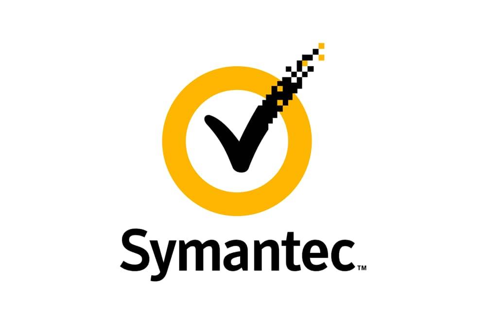
Symantec is a company that provides security services for people. Although it looks simple, the Symantec logo is very creative and easily recognised around the world. Characterised by the black checkmark and the yellow circle, there is a story behind the company's choice.
The black checkmark is used because they also acquired Verisign, a network company that allows you to connect with anyone from anywhere in the world. Apart from that, the checkmark represents success and authenticity. The yellow circle instills confidence, security and trust in the brand. The circle also denotes continuity, durability as well as protection for clients who might seek their services. So, for a company that paid $1,280,000,000 for its logo, it is quite obvious that they got their money's worth.
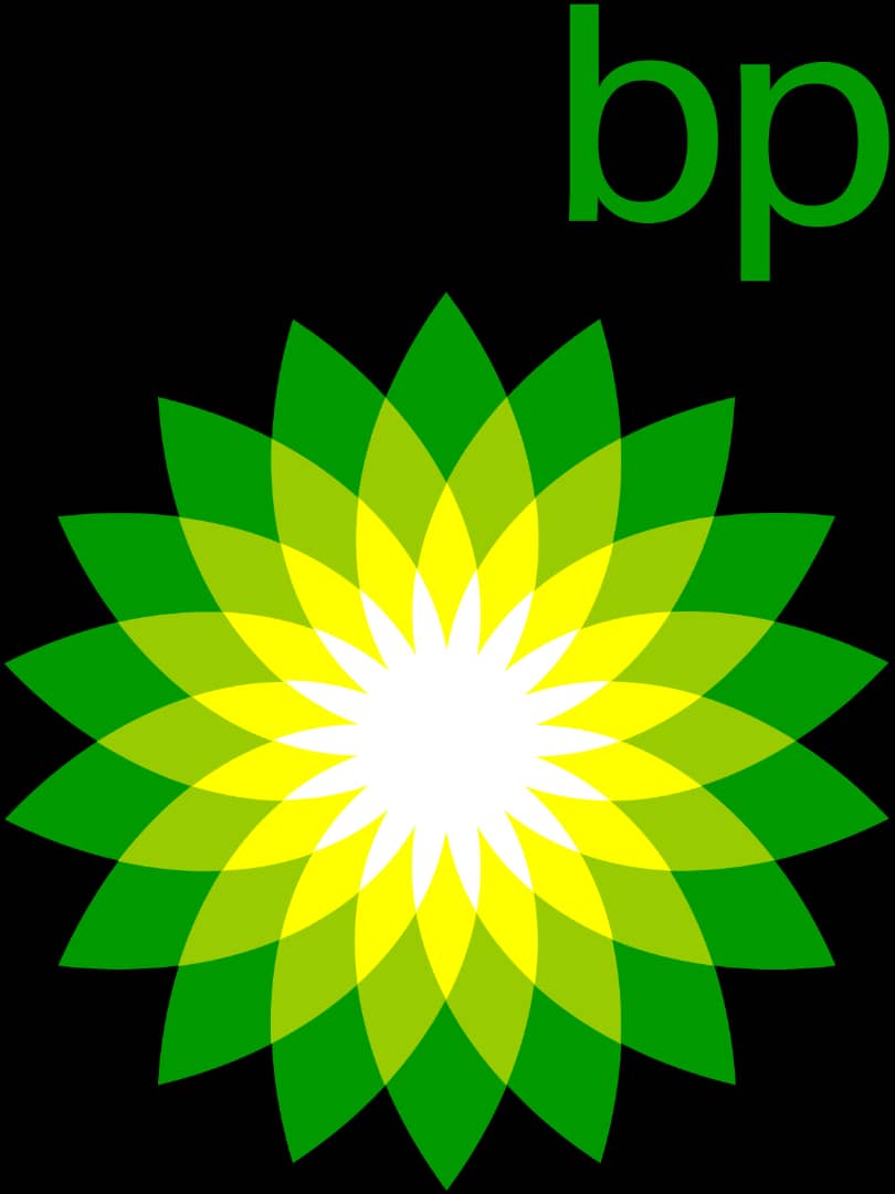
British Petroleum Logo And Marketing

British Petroleum used their old logo for 70 years and only changed it in 2008. The new logo was redesigned by Landor Associates.The new logo design is a green and yellow Helios that has a small emblem of the company's initials on top. Redesigned for $211,000,000, the new brand design was done because of the merger with Amoco.
The blue and green colour choices are both bright and bold and stands for the natural energy the company deals in. The stylised sunflower is for the sun's natural energy and the green surrounding is an indication that BP is an environmental-conscious company. Essentially, the new logo represents many things amongst which are BP's stand as a company moving beyond the petroleum sector with care to the state of the environment.
Accenture
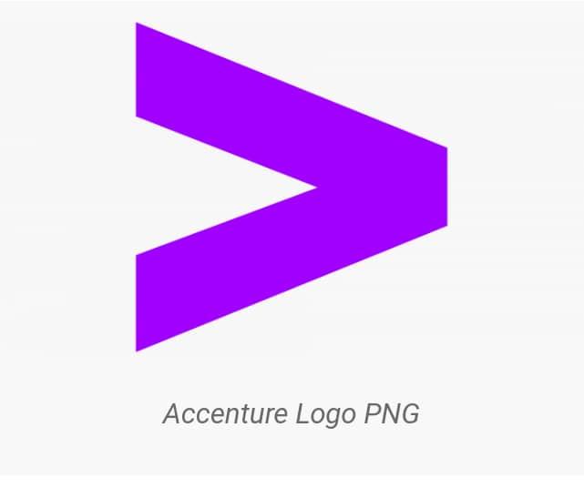
Just like they did with the British Petroleum logo, Landor Associates redesigned Accenture's logo for $100,000,000 only. With their slogan being 'High Performance. Delivered', the 'greater than' sign located above the 't' indicates the promise of something more in the future. Also, the small letter 'a' used in the company's name expresses easy access and care for their consumers.
Posten Norge Rebrand
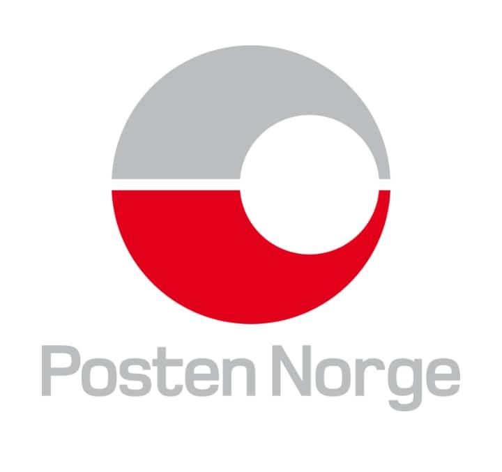
Owned by the state of Norway, Posten Norge is the only postal organisation that is allowed to distribute letters below 50g across the country. Their logo was designed for $55,000,000 and the logo is a simple circle with halves that flow into each other. What this represents is the seamless delivery of letters from the sender to the recipient. Along with the halved circle is an inscription of their name 'Posten Norge', which means Norway Post.
ANZ
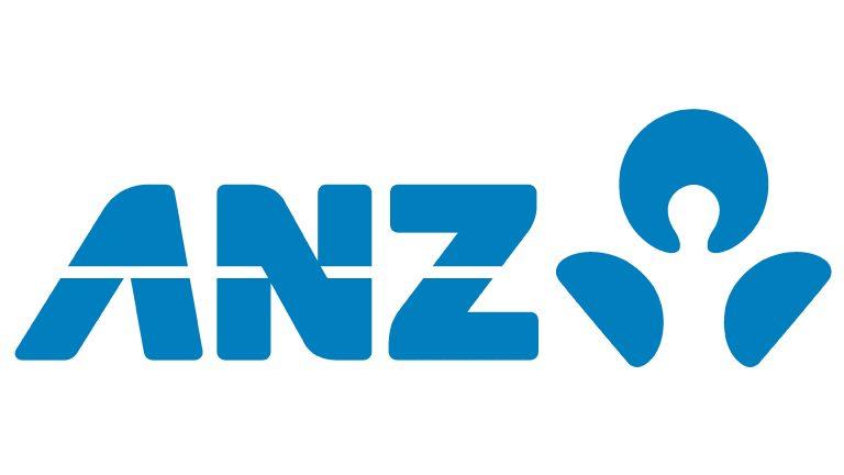
ANZ redesigned their logo when the merger between Australia and New Zealand was complete. The merger made ANZ the biggest bank in New Zealand and the third biggest in Australia. The ANZ with the single white stripe stands for Australia, New Zealand and Asia-Pacific. There is also an abstract feature that looks like a human. The company decided to use this logo because it represents the driving force of their business: their customers.
Attaining that kind of fame, ANZ had no issues with redesigning their logo for $15,000,000. But two things they didn't change were the classic blue and white, which represent stability, security and reliability. Features that are easily associated with a bank. Till now, the classic blue and white remain the company's major colours.
BBC Logo Redesign
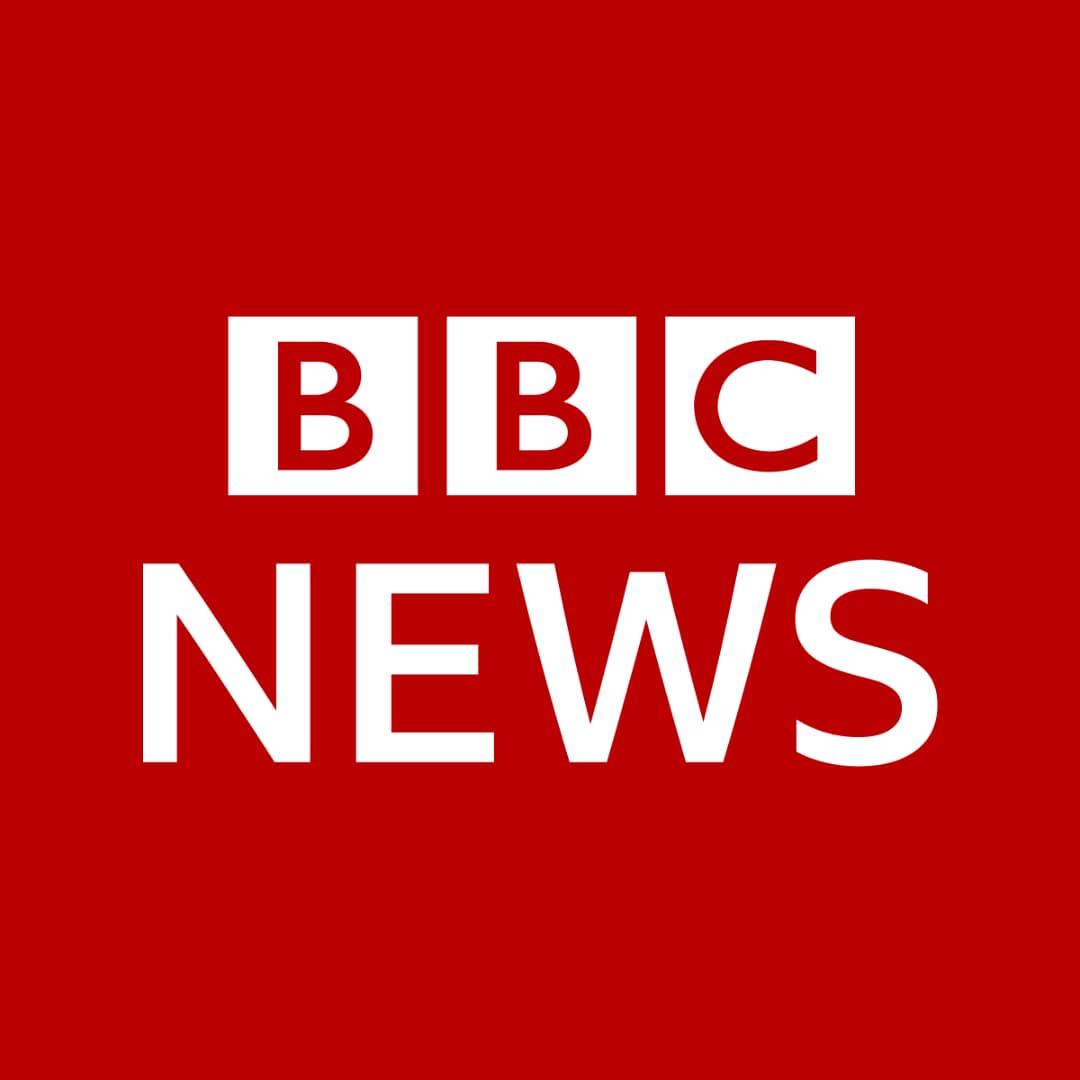
The BBC logo is well recognised and practical. The brand is well-known for its fresh and reliable news. For a long time, the simple white letters on a black background encased in small separate squares have been the logo of this brand. The idea behind the logo redesigns was to get a minimal feel. And the black squares in the logo represent reliability and unambiguity, which are considered features of a news channel. Although charged at $1,800,000, the BBC logo is simple and practical and effortlessly represents the quality of information they provide.
CitiBank
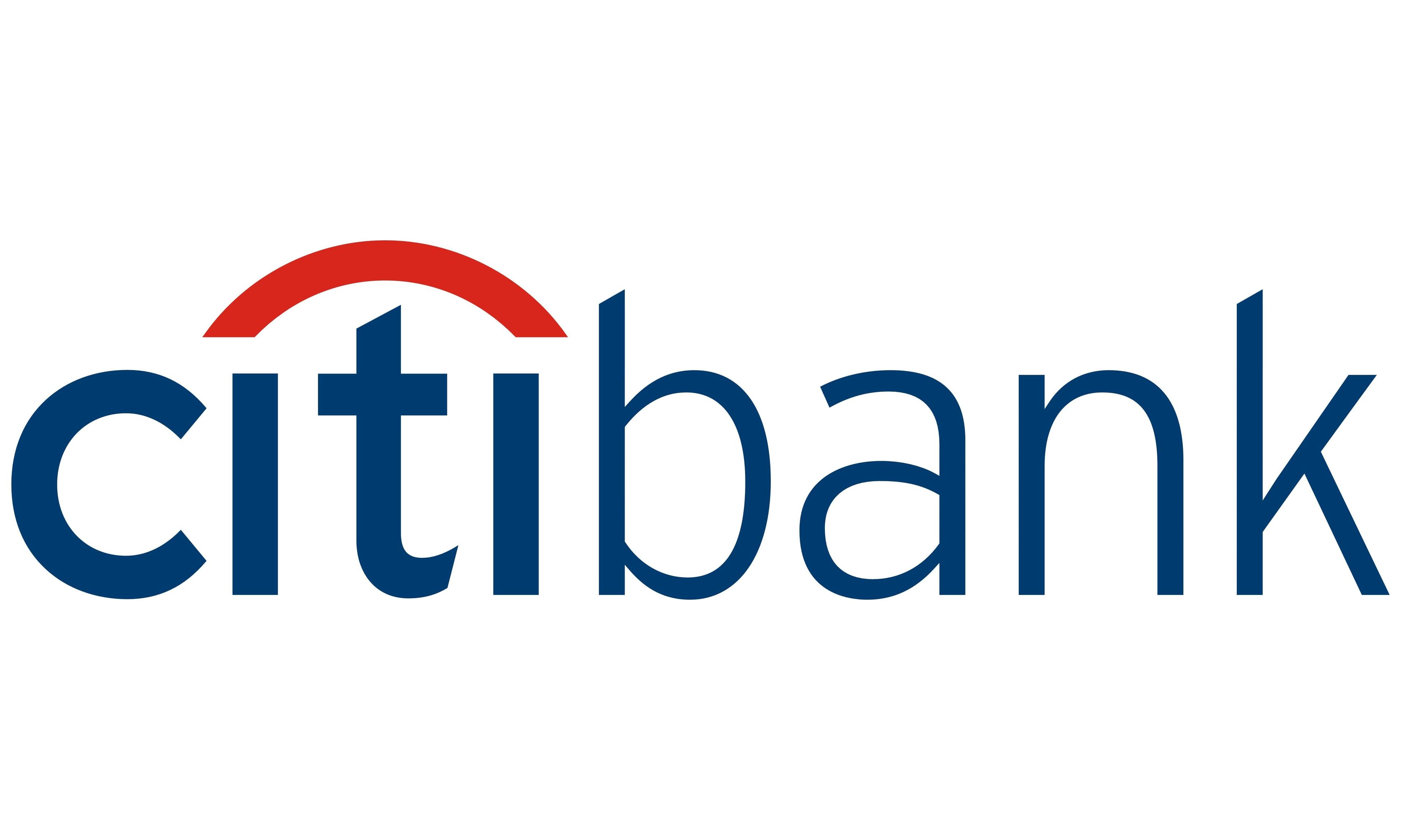
The Citibank logo was first designed on a napkin in a meeting with the designers after Citicorp and Travellers Group had formed a merger. Designed by Paula Scher and her team 20 years ago for the sum of $1,500,000, the logo remains of great importance to the bank. And since then, Citibank decided to use the logo for as long as it could.
Pepsi Logo
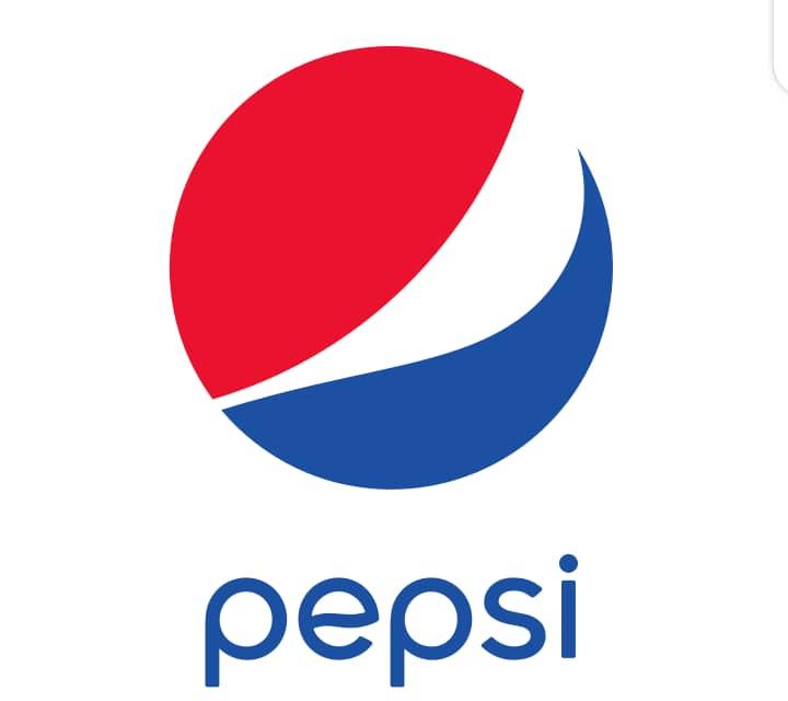
The Pepsi logo is a simple affair with a circle and 3 multicolour waves. The idea behind the logo redesign was to put out a challenge to Coca-Cola, their biggest rival in carbonated beverages. Although we can't be certain about which brand is doing better, the fact remains that the Pepsi logo is truly amazing.
Even though Pepsi is one of the world's leading brands in manufacturing carbonated beverages, they still managed to redesign their logo for the sum of $1,000,000. Which is considerable compared to the amount other brands spend.
London 2012 Olympics Logo
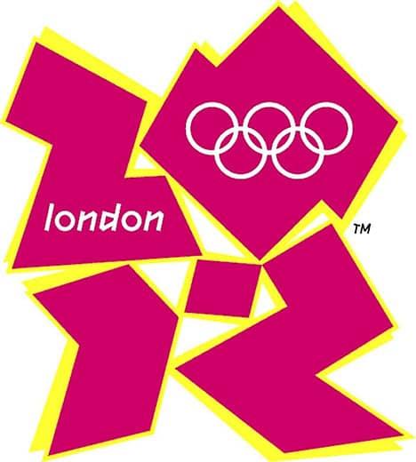
We all know that the Olympics event takes place and is hosted in different countries every four years. Most times, countries raise donations for the event because they want a better experience than the last one. While some of the proceeds from these donations go into equipment and tourist attractions, some go into the logo design.
The most expensive logo design that was done for the Olympics was the logo from 2012, which cost $625,000. The designer intended to recreate a cubic, as well as reconstruct London's architecture. The logo turned out to be too abstract and complex, which made it receive a lot of criticism. Apart from that, people disliked the logo because it did not represent any of London's culture or landmarks.
Belfast
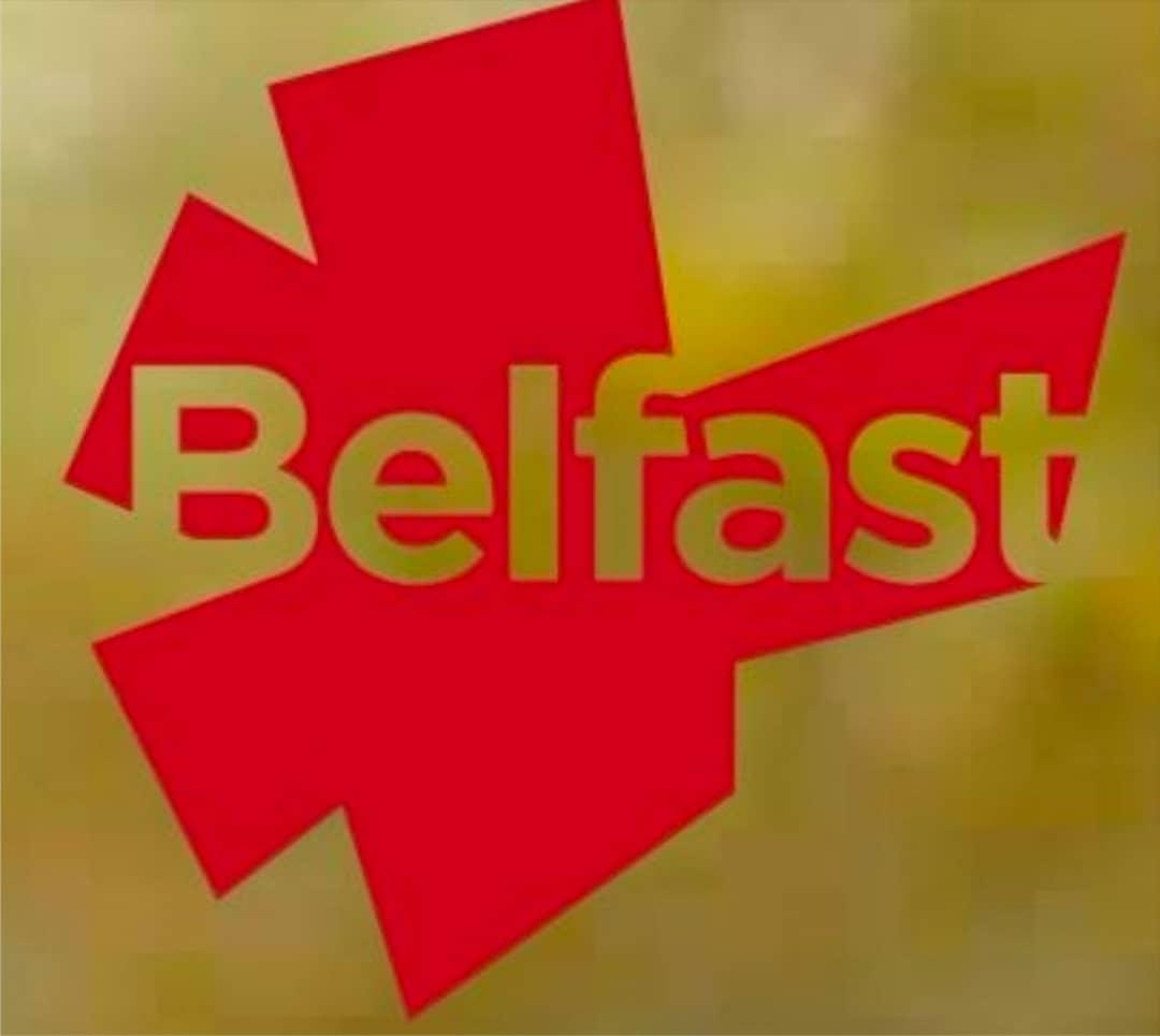
The Belfast logo is a perfect example of what simple logos look like. Encased in a heart is the name of the city, a straightforward design decided on by the designers.
The designers made the heart of the logo look like a stylish 'B', which still stands for 'Belfast.' Redesigned for $280,000, the reason for the simplicity behind the logo is to attract tourists and give people fond memories of the city.
Conclusion
You might not have a large budget for logo designs, but you should make the right choice when it comes to your logo. Your colours, styles and logo story should be authentic as they represent a lot about your business. Going through the list above can give you an insight into what you should consider for your logo designs. Now, with our Design And Earn Masterclass, you can learn how to create world-class designs that will keep you outstanding and earn you lots of cash. Right now, click here to begin your class.